
Using Shayr on iPad
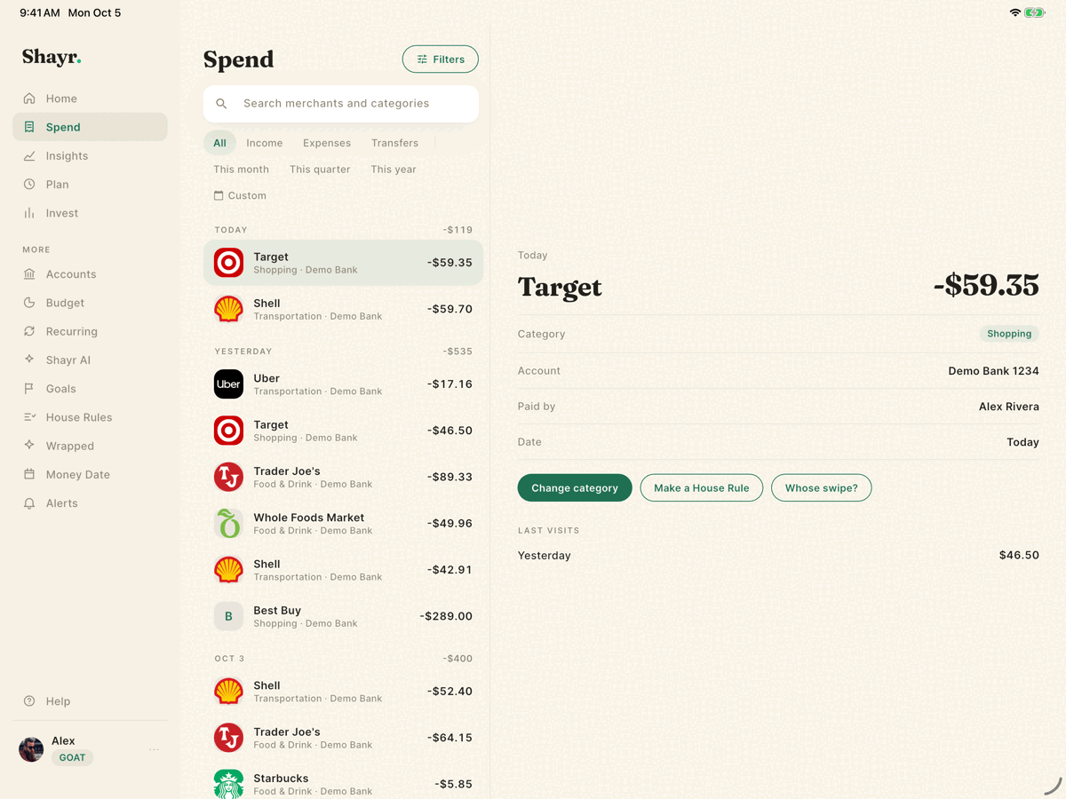
Shayr runs on iPad in any orientation and in Split View. In landscape it shows a sidebar and wider screens with details beside the list. In portrait it uses a slim rail on the left. The features and your data are the same as on iPhone.
Steps
Use the sidebar on the left. Home, Spend, Insights, Plan and Invest sit at the top. Under More are Accounts, Shayr AI, House Rules, Wrapped, Money Date and Alerts.
On Spend, tap a transaction. Its details open on the right while the list stays on the left. The buttons Change category, Make a House Rule and Whose swipe? are there.
Tap your name at the bottom of the sidebar to open the menu. It holds Family, Logout and the gear icon for Settings, where Personal Details is the first row. Budget, Recurring and Goals open from the Plan tab, and the sidebar keeps Plan highlighted while one is open.
How the layout changes
| Window width | Layout |
|---|---|
| Under 600 points (iPhone, small Split View) | Bottom bar and slide out menu, like iPhone. |
| 600 to 899 points (iPad portrait, mini) | A slim left rail with the five main tabs, More and your picture. Screens use two columns, and transaction details slide in from the right. |
| 900 points and wider (iPad landscape) | The full sidebar and up to three columns. Content is capped at about 1,200 points wide. |
Screens designed for the wide layout
Home, Spend, Insights, Plan, Budget, Goals, Recurring, Spending patterns, Wrapped, Investments, Accounts and the sign in screens. Other screens are centered at a comfortable width.
Pop ups
Sheets that slide up from the bottom on iPhone appear as a centered card on iPad, up to about 560 points wide.
What does not change
There are no iPad only features. Account, plan and household features all work the same. Rotating or resizing the window keeps you on the same page.